MAKE SURE YOU CONTINUE TO RECEIVE EACH ISSUE OF TUESDAY MARKETING NOTES—CLICK HERE TO RENEW YOUR FREE SUBSCRIPTION (IF YOU'VE ALREADY SUBSCRIBED, NO NEED TO RE-SUBSCRIBE)

Design for Non-Designers: Expedient Layout Techniques for Field Marketing Deliverables
by Eric Gagnon
At busy sales departments in all companies, marketers are constantly under pressure to produce new marketing deliverables to support lead generation activities, new business development, and, especially—ongoing lead development activities. As a marketing professional, you are often directly responsible for developing and executing all of the marketing deliverables described previously. Often, and especially for relatively simple projects, such as sales flyers, information premiums (white papers, reports, etc.), and handouts, you may find yourself having to specify, or even produce the layouts for these deliverables on your own, due to the urgency of the need to execute for a critical marketing project or selling opportunity.
Commercial design is its own discipline, and skilled designers work hard to perfect their craft. The purpose of this TMN is not to teach you how to be your own designer, but to provide some basic guidelines and techniques that will help you to outline or develop simple marketing deliverables on an expedient basis to support your company’s sales team.
In these critical marketing projects, it’s important you know a few rudimentary design and layout skills you can apply universally to all of these marketing deliverables to help them clearly and effective present the benefits of your product—or, for other, more information-oriented applications, such as white papers or reports—to communicate the clear meaning of your content.
Even when you’re not designing the piece yourself, knowing some of the most useful and important principles for designing and producing marketing deliverables helps you lead the process more effectively, working with your company’s layout designer, ad agency, or marketing consultant. Either way, by following the techniques in this section, you can produce a competent marketing deliverable that effectively presents and sells your company’s products, conveys important information clearly and persuasively to prospects, and most important, uses basic design techniques to enhance communication of your information to your prospects.
Guiding Design Principles for Non-Designers
Here are some general principles that apply to any deliverable in any marketing project; these guidelines will help you both in expedient, do-it-yourself layout projects, and when you’re working with a designer or marketing consultant on the design and layout of a marketing deliverable:
1.) Focus on presenting the information, not on designing the piece:
The most important principle to follow as a non-designer is to understand that good design means clear, effective, communication of the information, idea, or (most often) the major benefit of the marketing deliverable. All design and layout considerations are secondary to the goal of clear presentation. Any marketing deliverable can be designed in an unlimited number of ways, but ultimately, the only important factor in determining whether or not a deliverable is successful is not how well it’s designed, but how effective it is in communicating a product’s most important benefit to the reader or viewer, in a way that motivates this reader to take one step closer to buying your product. A marketing piece is successful if it can both achieve the latter goal, and meet a minimally acceptable level of design competence, and these basic design skills can be learned by anyone;
2.) Organize your layout by the importance of its information elements:
What’s the most important thing you want to say? And the most important thing after that? And after that? To clearly present the essential information elements required to produce an effective layout, organize these elements in the order of their importance to the reader. When applied to marketing deliverables, this usually means the most important sales benefit is the most prominent, followed by the next most important benefit, followed by more detailed information. Many marketing deliverables share a common structure that’s found in most ads, brochures, and other marketing pieces, consisting of: Headline, subhead, body copy, and call-to-action. These elements are useful in helping you organize your layouts to make the most important benefits and features of your company’s product clear to your readers and viewers. Following the Three-Step Copywriting Exercise, detailed here, will help you develop the critical sales copy you need as source material for your expedient layouts;
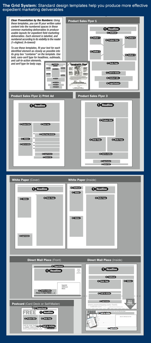
3.) To begin your layout, start with a grid:
Designers often use what is known as the “grid system” as a starting point for determining initial placement of the major elements in their layout such as headline, subhead, graphics, body copy and call-to-action described in the previous paragraph.
Using lines and boxes to define the areas where these major elements will fit helps designers establish the sizing, balanced proportions, and contrast between these elements that lays the foundation for a well-designed marketing piece. As a non-designer you can also use grids as the basis for your layouts as well, to help you “rough out” the areas that will contain the major copy and graphical elements of your marketing piece. The sample grid templates for several of the most commonly-used marketing deliverables shown in this graphic below are good starting points for your expedient layouts:
4.) You can’t go wrong with the Golden Mean:
The Golden Mean, also known as the Golden Rectangle, is a rectangle whose vertical sides are in proportion to its horizontal sides by the ratio 1:1.618. The Golden Rectangle has been used throughout history in art, drawing, architecture, and design, and is universally recognized as a visually pleasing shape. The Golden Rectangle also exists throughout the natural world, and, with mathematical variation, in many things we see in nature. The design of many commercial products is also based on the Golden Mean—especially products designed for visual use: It’s no coincidence that movie theater screens and flat-screen TVs are sized in this proportion.
The Golden Mean is a useful shape that makes it an attractive element in a grid layout (as shown previously), and as a “container” for any graphical element: Photos, illustrations, text headlines, body copy, or any other text. It can be used either horizontally or vertically, and combined with Golden Rectangles of any shape in a layout to provide a reasonably attractive starting point for the layout of printed sales flyers, brochures, and Web pages.
5.) Use less color and fewer fonts:
If you use color sparingly in your layouts, for example, using it only for logos, photos, and solid color where needed (such as on the cover of a brochure), you’ll have a better-looking and more effective layout, and you will reduce the risk of using color in a way that distracts readers from the text benefits shown in your headline and body copy. Remember, just because you can print unlimited colors in a four-color layout doesn’t mean you have to. Also, limit the fonts you use to the following “classics” used in many ads and layouts: Helvetica, Franklin Gothic, and Futura for sans-serif fonts, and Times or Century for serif fonts
Design and Content Checklist for Effective Layout of Field Marketing Deliverables
• Headlines come first: Your layout’s headline is your most important sales message—always. Headlines should be set in big, bold type so they’re very readable, even at a distance. Graphical elements of a marketing piece, such as photos or illustrations, should not distract the reader from your ad’s headline, nor should they dominate your headline.
• Tight kerning is good: Kerning is the amount of spacing between the letters of the text of your layout. A headline with kerning set “tighter” than a headline with no kerning conveys a sense of greater urgency. Tighter kerning in long blocks of copy also allows you to fit more words in the same space.
• Where’s your Web site and phone number, and what do you want me to do next? It’s surprising how much time and money companies spend on their marketing, yet at the end of their marketing materials fail to tell the reader how to contact them. Don’t repeat their mistake in your ads—always feature your company’s phone number and Web and mailing addresses in big, bold type across the bottom of your marketing materials. Your prospects want to reach you, so why should you stop them?
• White space is nice, but the black space does the selling: If your product requires long sales copy, your marketing pieces should use long copy. Don’t let others criticize your layouts for having “too many words,” if you believe those words are well-written, tell your company’s story, and sell your company’s product. If your product’s sales benefits are effectively communicated in your advertising copy, your prospects will read your advertising. Let the meaning of your ad be the master of your layout.
• “Busy” is good, if it’s interesting: There’s nothing wrong if, in addition to copy, your ad requires diagrams, sidebars, or thumbnail photos. These information-rich layouts work very well for products requiring detailed explanations, or those aimed at technically-oriented readers, like engineers, programmers, or doctors, who are likely to have detailed questions about your product. These layouts require extra skill, so they are probably best left to your agency’s ad layout person. However, for these more complicated layouts, you can always supply a basic sketch to show an initial view of your idea, and it always helps to have some examples for them to work from (see paragraph below).
Layout Devices that Improve Presentation and Selling Power
As you think about your marketing deliverable, and work on your layout, organizing the most important sales copy information into areas using grid templates, shown previously, you can incorporate additional text and graphic “devices” in your layouts to make certain major elements of your layout bolder, to draw attention to important aspects of your product’s story, or to explain complex processes and concepts. Examples of these useful features are shown here:
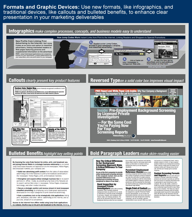
Bulleted lists: Short lines of bulleted text are useful ways to communicate additional benefits, product features, or other important “reasons to buy” in your layouts. Because they make it easy for busy readers to see and skim-read these benefits or key selling points, bulleted lists help to break up long body copy, or can be used as sidebars alongside body copy to summarize your product’s key benefits. Bulleted lists are also a very useful shorthand method of communicating product benefits for layouts having limited space, such as fractional ads or postcard mailers.
Infographics: To illustrate technical processes, concepts, or other complex ideas, you can use infographics, which are small sidebars using text and graphics, or simple diagrams, combined with a header or a caption to add explanation, as shown in the chart above. Infographics are another method of helping your busy skim-readers get the gist of your product’s features, operation, or underlying technology, without expecting them to read your entire layout. While many infographics are better left to a designer, you can use simple shapes or symbols to create a basic example, or make a sketch for a designer, who can execute one for you; infographics can be used in layouts for other marketing pieces, as needed.
Callouts: To highlight major product features or benefits, you can use callouts, which are short text lines or paragraphs enclosed in boxes, using lines pointing to the described feature in the product photo or graphic used in the deliverable. Like infographics, callouts make it easy for your readers to see your product’s main benefits and features at a glance. Callouts can be single lines of text, or longer paragraphs; when using longer paragraphs, lead the first few words of each paragraph with key benefits or feature descriptions set in bold-face type to make these essential points stand out to your reader.
Reversed type in solid color boxes: Want to increase the attention-getting power of your headline in a sales flyer, mailing piece or other deliverable? Set it in white type, reversed against a dark, solid color background. This technique is used to make traffic signs more readable from longer distances, and warning labels stand out from other text, and it’s commonly used in marketing pieces, usually in headlines and text boxes inset in body copy, to draw attention to text in layouts.
These basic layout techniques will serve you well on those expedient pieces you’ll need for those smaller, last-minute marketing projects, and to support your sales team as they engage their prospects. For basic deliverables, like simple sales sheets, product fact sheets, or very simple flyers, these techniques can help you get it done when you can’t wait to have someone produce it for you, or your designer’s bogged down on another marketing project.
Eric Gagnon (eric@realmarkets.net), a director with the Business Marketing Institute, is author of The Marketing Manager’s Handbook and The CRM Field Marketing Handbook, and president of GAA ( http://www.realmarkets.net ), an interactive marketing, turnaround, and product development consulting firm.