


 |
 |
 |
 |
Tuesday Marketing Notes (Number 103—November 20th , 2007)
MAKE SURE YOU CONTINUE TO RECEIVE EACH ISSUE OF TUESDAY MARKETING NOTES—CLICK HERE TO RENEW YOUR FREE SUBSCRIPTION
(NOTE: If you’ve already signed up previously at this link, no need to do so again)

Creating Accountable Advertising (Part 2)
By Rick Kean, CBC
Last week we offered a few suggestions on how you could make your advertising more actionable and accountable. Those ideas are not new, not based on ad readership scores or the analysis of inquiries or any magic formula, but just upon plain old common sense applied to the communications process.
That being the case, you might logically ask, if it’s common sense, why do we need them? We need them because common sense, especially in marketing communications, is usually ignored. How else can you explain phrases like: “message management,” “solution messaging,” and “value mapping” to describe it?
I’m convinced that much advertising fails because it’s based on those kinds of delusions of grandeur. And because of these scrambled priorities, more ads are ignored than are noticed. And of those that are noticed, few are read. And that's tragic—because business people go to their publications seeking information—yet they find little of it on the advertising pages. The editors do their part...the advertisers miss an opportunity.
Ads that contribute nothing to the buyer's understanding or imagination do sellers absolutely no good. And what's worse, by a sort of Gresham's Law bad advertising smothers good advertising—and the usefulness of all advertising suffers.
Work on the assumption that nobody really wants to read your ad. Assume they don’t know what your product is or what’s so good about it. Assume they’re very busy and you have only seconds to implant your most important selling points into their brains. OK? Read on . . .
Make it Real
The illustrative treatment and language used in describing the ad's selling proposition can make all the difference in the world in getting the reader to believe it's real. The type of job the reader has and their business habits should dictate the type of message and the manner of its presentation. Construction people like to see products at work outdoors. Chemical engineers are happy with flow charts. Designers work with drawings. Managers relate to people in photographs or illustrations. And so on. Once again, the key is reader orientation. Each statement should be made from the user's viewpoint, not the seller's.
There are several ways to make it real: You can show the product in use, show a test, show a before-and-after, stage a demonstration, show a comparison with a competitive product or service, detail a beneficial feature, educate the reader in product usage, detail the product’s appearance, show an "exploded" product, or use call-outs to indicate features.
Generally speaking, photographs are most communicative, followed by cutaways, graphs and charts, and drawings. Again, frequent use of the pronoun you, avoidance of advertising cliches, a friendly person-to-person tone—help the reader to visualize themselves in the position of benefiting from what you are trying to sell them. Remember, abstractions, generalities, long words, and the advertiser's opinions about himself are reader-killers, because they are un-real.
Reinforce your Proposition
To make the promise believable, the ad must provide hard evidence that the claim is valid. The advertiser’s say-so just isn't enough. Sometimes, a description of the product's design or operating characteristics will be enough. Comparison with competition can be convincing. Case histories, because they give the reader a detailed product success account, makes the reward appear attainable. Testimonials offer a powerful third-party recommendation that is inherently more believable than clients pushing their own product or service. In other words, "they-say" advertising carries much more weight than "we-say" advertising.
Refine What You've Written
Almost always, copy can be improved. And it's better for the original writer to do the improving than to have his work subjected to the blue pencils of the copy chief, account executive, or the client. Unfortunately, most copywriters will pour their best efforts into headlines, working and reworking to achieve cadence, alliterations or whatever, and will dash off the main body copy in a single pass. Hurried copy results in copy that's too long (it's easier to "write long" than to "write short"), Paragraphs that are too long. Sentences that are too long. Words that are too long. Too much passive voice.
Here are ten copywriting disciplines which, although they may take the writer a longer time, are sure to make it easier on the reader:
10. Give each paragraph a single idea to develop (7 or 8 lines max.);
9. Break up long sentences;
8. Favor one-and two-syllable, short Anglo-Saxon words;
7. Use active voice rather than passive voice as much as possible. For example: "Since Gizmos have been designed with only one moving part, frequent lubrication is eliminated," could be better said: "The Gizmo has only one part, So you oil it less often;"
6. Cut out all those words from the cliche' hit parade, words like "quality, reliability, dependability, integrity;"
5. And those invisible phrases that are so overused no one pays attention to them anyway: "Industry leader, dedicated to quality, we're number one, top of the line, constant improvement, lowest prices, customer-oriented;"
4. When you have a choice, use singular subject rather than plural;
3. Say it with verbs rather than adjectives. For example: "Gizmo is economical to operate," or better yet, "Gizmo costs less to run;"
2. Replace abstractions and generalizations with specifics;
1. Avoid all those weasel words that imply something that can't be truthfully stated, like "fortified, acts like, virtually, practically, can be, reduced, somewhat, and special"
Reveal the Message
The sole purpose of a layout is to size and arrange the components of the ad in such a way that there is an unmistakable entry point and the reader’s eye will be directed from one component to another in a sequence that follows a logical development of the selling proposition. The layout should never call attention to itself. It should only be the frame in which the various components are arranged. The simplest, safest and most logical layout structure is one with the illustration at the top, the headline underneath, followed by two or three columns of text and the signature in the lower right.
Many art directors choose to ignore this fact—which is why we see so many ads in which the design competes with or entirely overwhelms the message. This basic configuration does not present any challenge to an art director—unless he or she is keen enough to see that the layout is just a frame within which he should exercise his or her creative talents to illustrate the message. While this format is not suitable for all purposes, there should always be a good reason for dismissing it as possibility other than the desire to "be different."
Reduce Eye Strain
The reader won't stay long enough to read the text if the ad makeup and typography are uninviting. The more detours the eye encounters, the more difficult the copy will be to read. Some of the layout faults that discourage reading of the text and create stumbling blocks to understanding are stylistic devices, bizarre designs, or irrelevant visuals, type set in reverse or against a tinted background, or too much of everything. If there is too much copy for the space, cut the copy rather than set the type too small. It's true that typography has become a lost art, and the least understood part of our business. Everybody with a computer has become a typesetter. Magazines are loaded with ads in which the most essential part of the advertiser's message, the copy, appears in type that's hip, but unreadable, or that's too small, or is squeezed into a corner, or is printed over part of the illustration. Text type should never be smaller than 9 point. 10 or 11 point is just about right. Most of our word processing today is in 12 point.
And you should use typefaces with serifs, those are those tiny "wings" on the edges of characters. Serifs help the eye pick up the shape of the letter. Text should appear black on white, and should stand clear of interference from any other part of the ad. And copy should never be set in a width that is more than half the width of the ad, 40 characters, an alphabet and a half. These are all rules that editors follow; only the advertisers feel the need to break them.
Invite a Response
Your copy objective may be:
• To create leads to create sales;
• To qualify prospects;
• To introduce a new product or service;
• To promote a product or service to build a company image;
• To build brand image;
• Or, a combination of all of the above
But ideally, the ad will make something happen, and it costs only a short closing paragraph to suggest what that should be. We call this the “call-to-action.” Here are some of the possibilities:
• Call an 800 number, or a visit a Web site;
• Write to obtain literature, or a sample;
• Call a salesman or distributor;
• Specify the material or component on next order;
• File the ad for future reference;
• Tell where the product can be seen in use or on display
Now, here it might be appropriate to ask: Are sales a proper measure of business advertising success? Many of you might answer “yes.” But you'd be overlooking the effects of other factors in the selling process—product price, delivery, competition, etc. Factors that advertising can't control. It's like measuring a quarterback's performance on the number of games won—as though the rest of the team didn't exist. Before you can measure advertising's effectiveness, you first need to define and isolate its specific role in the selling process.
Register the Company Name
An often-stated reason for advertising is "to keep our name out there." I suspect that's the minimum you could expect from advertising, but some industrial advertisers appear to consider it their prime purpose, so you frequently see ads in which the largest thing in the ad is the company name or the logo. An ad should make the readers want to buy before telling them where to get it. An ad can be considered successful when it has communicated one new fact or made a single favorable impression. The reader won't remember everything he or she has read and seen—so the advertising people should make darn sure they remember the one thing you want them most to remember.
A good test for an ad is to ask anyone to "describe what it says in 25 words or less." If the answer doesn't say what the ad was intended to say and what the advertiser wants most for the reader to remember, then ad has failed, and it's time to go back to the drawing board. Your ad may be your first meeting with a future customer. It should represent you at your best. The ad’s appearance and the tone of its message will create an image in his mind that should be a description of the corporate personality as you would like to have him visualize it. A company's advertising represents the best opportunity the company has (even better than the sales force) to portray the company's personality, the things that will make the company liked, respected, and admired.
Finally, a word of warning. Faithfully observing all these "rules" will not guarantee an ad's success. What an ad says is primary, how is secondary. Most important to success is the message itself—its inherent concern to the reader. And the "rules" will not help much to create the statements, the words and imagery that most dramatically express the desired relationship between buyer and seller, between benefit and product, between proposition and alternatives. But the "rules" will reduce the chance of the ad's failing because of being ignored or misunderstood or disbelieved. And if you don't learn the rules, you're doomed to an agonizing process of learning by trial and error, a poor use of time and money. Once you know them, you shouldn't be afraid to break them and once you've succeeded at learning and breaking the rules, you can start making your own.
Rick Kean, CBC, is Managing Director of the Business Marketing Institute, a Web-based skills building center for business-to-business marketers and marketing communicators. He can be reached at rkean@businessmarketinginstitute.com or at 312-371-5663.
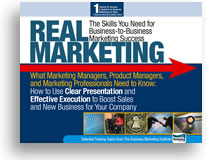
Real Marketing: The Skills You Need for Business-to-Business Marketing Success, a 47-page overview of content covered by the BMI MSA/B/C Training and Certification System


Login![]() Home
Home![]() Free Demo
Free Demo![]() Free Newsletter
Free Newsletter![]() Order Now
Order Now![]() Contact Us
Contact Us
Copyright 2005-2007 Business Marketing Institute, LLC
